
Tete
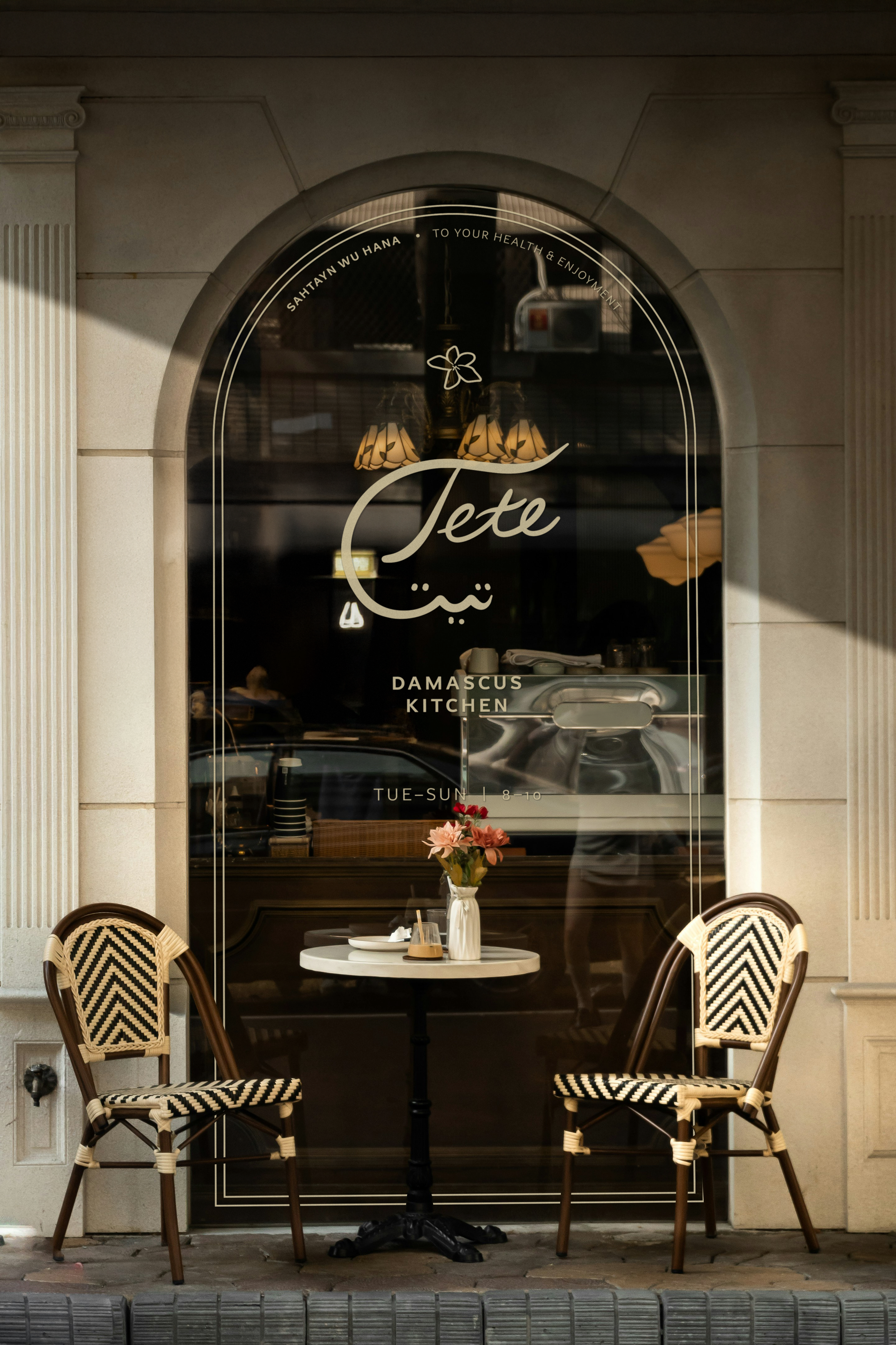
CONCEPT | RESTAURANTS + BARS | 2026
A bilingual identity for a Damascene home-cooking restaurant, warm and specific by design.
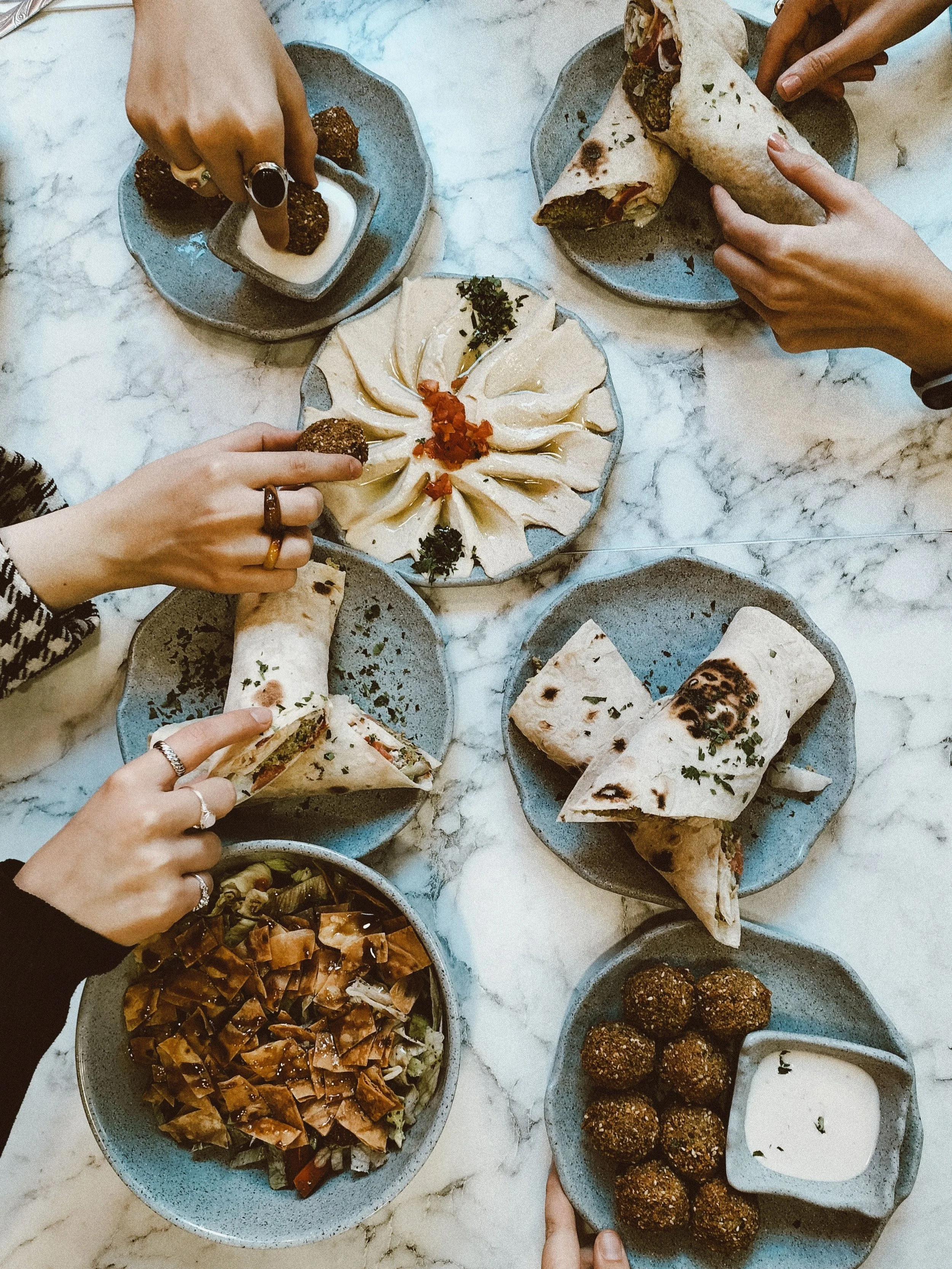
Tete, or Teta—“grandma”—is a self-initiated concept for a Damascene restaurant in Brooklyn, built on the home cooking of one family. I envisioned an owner who left Damascus as a child and cooks from memory: his grandmother‘s recipes, tea in her courtyard, the city of jasmine remembered from the inside. It’s warm, generous, and specifically Damascene—not upscale, not fusion, not a generic idea of “Middle Eastern.”
I developed Tete for the casual restaurant owner who leads with honest food and an open table.

The Client
A Damascene restaurant in Brooklyn—the home cooking of one family, from one grandmother.
Founded by a chef who left Damascus as a child and cooks from memory.
Warm, generous, specifically Damascene—not overly “elevated,” not generic “Middle Eastern”
A self-initiated concept project.
The Challenge
Feel specifically Damascene—warm, proud, personal—without falling into any clichés.
Serve two guests at once: the Syrian diaspora and adventurous, design-literate New Yorkers.
Get the cultural specifics right, and respectful.


The Approach
Center one grandmother’s story—specificity is the differentiator no one can copy.
A bilingual identity where Arabic and English sit as equals, mirroring the owner’s two worlds.
Warmth built from a real hand the brand should feel remembered, not manufactured.
Draw on authentic Damascene heritage (jasmine, the old city, tilework), never as costume.
The Inspiration
Damascus itself: the city of jasmine, courtyard homes, warm honey-stone and tilework.
A grandmother's table: generosity, welcome, food as love.
The anti-reference: lanterns-and-camels exotica, and generic “Mediterranean” vagueness.
The Tactics
Name: Tete, often spelled Teta, translates to “grandma,” putting the owner’s family table at the center.
Motif: jasmine as a soft, hand-drawn signature.
Bilingual system: Arabic and English designed to feel like counterparts, from menu to signage.
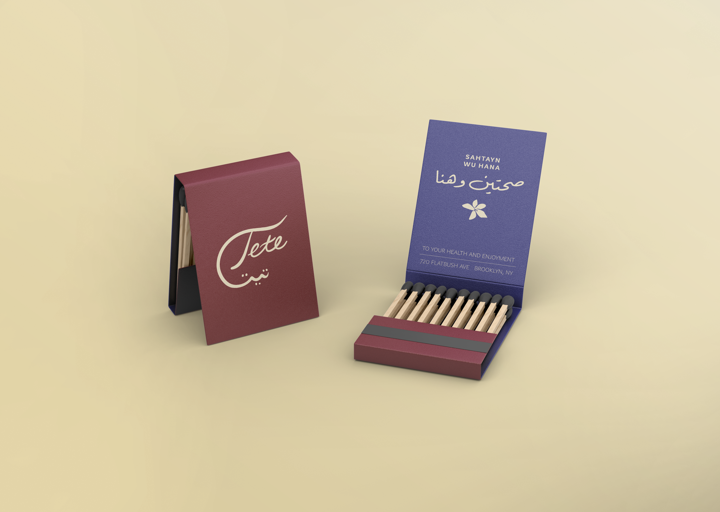
Voice: warm and plainspoken like a family member, carried by touches like sahtayn wu hana (roughly, “to your health and enjoyment”; similar to bon appétit).
The Deliverables
Naming and bilingual verbal identity
Hand-drawn logo suite, including mark and icon
Color system and bilingual typography
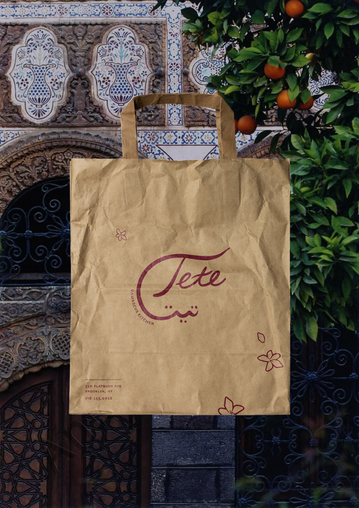
Menu system, signage, packaging, and applied collateral
Printed brand guidelines