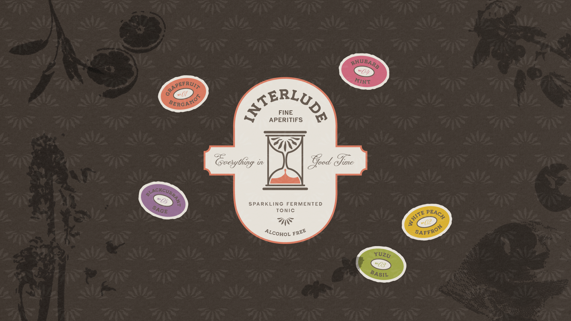
Interlude
CONCEPT | CRAFT + HERITAGE | 2026
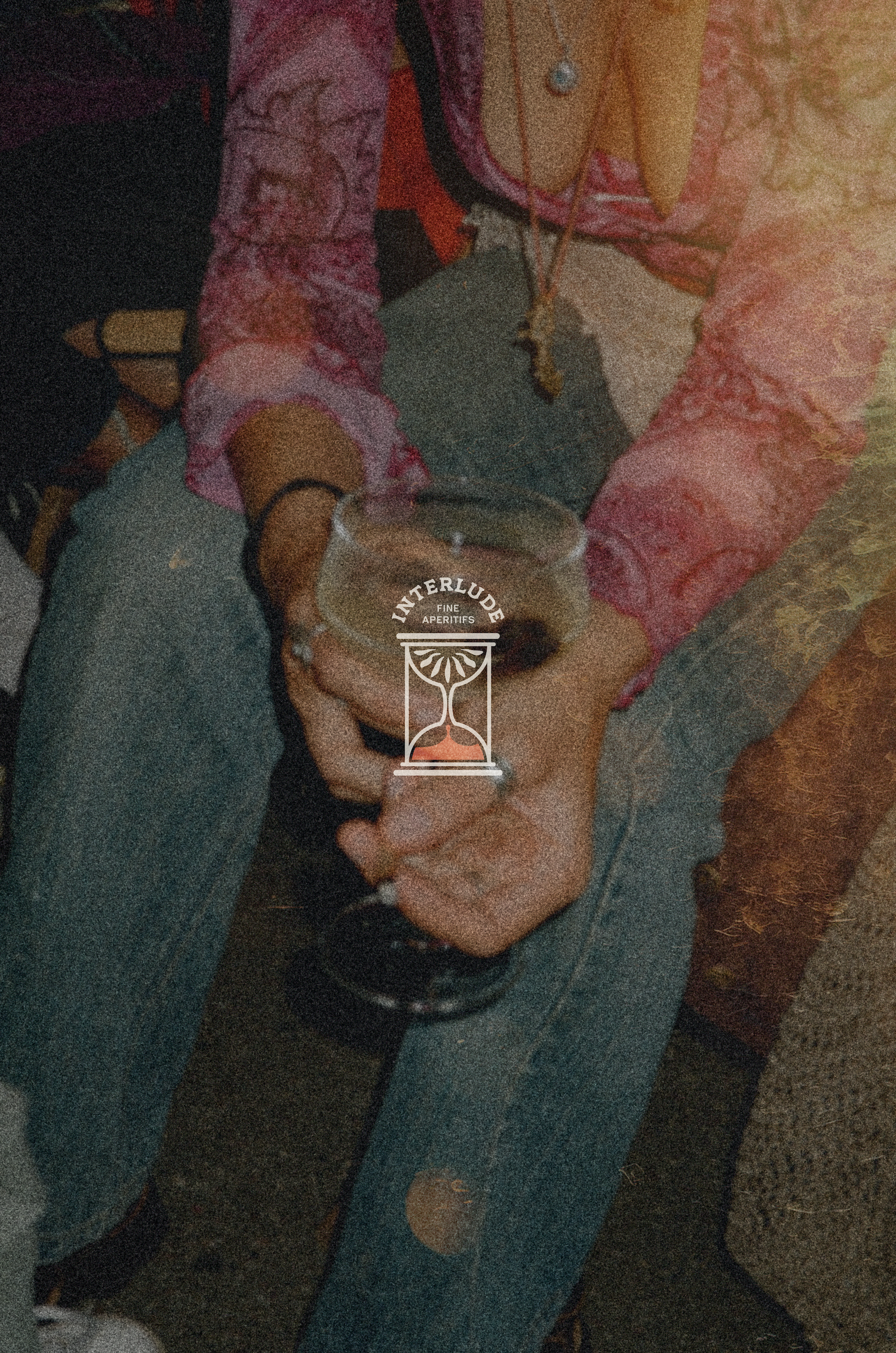
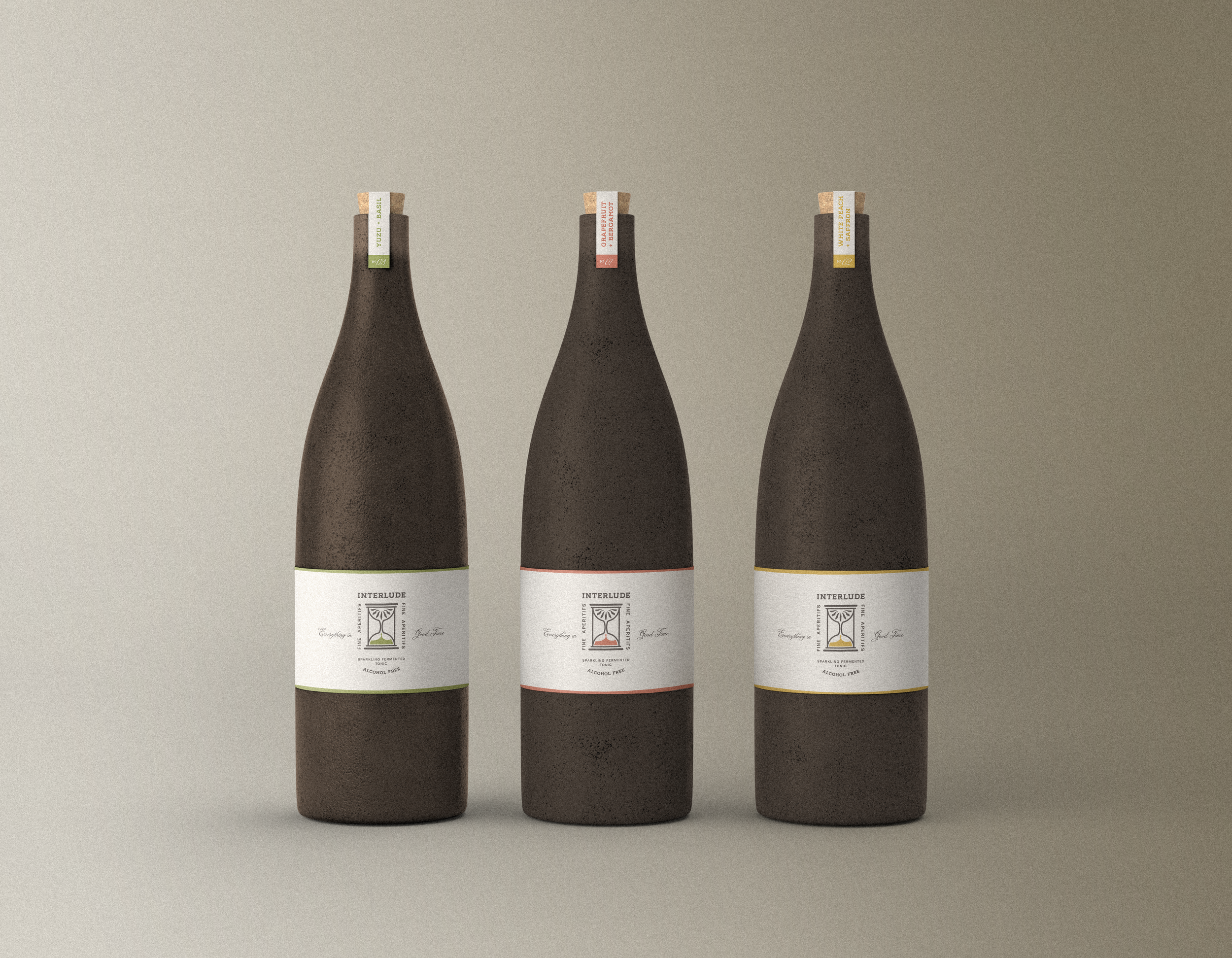
A restrained, textured look for a sparkling non-alcoholic aperitif.
Interlude is a self-initiated concept: a sparkling fermented tonic built for the person who is numb to the candy-colored wellness aisle and is still looking for a non-alcoholic drink that feels adult. Prebiotic, lightly functional, low sugar—but the function is quieter than the elegance. The idea is a bottle you’d set on the dinner table in place of wine: something considered enough to serve to guests, yet approachable enough to enjoy on your private patio.
I developed Interlude as a full engagement—strategy, naming, identity, and packaging—to explore what refinement looks like in a category that defaults to noise.
The Client
A sparkling fermented tonic; prebiotic, low sugar, quietly functional.
For design-literate adults who aren’t attracted to the candy-colored wellness aisle.
The bottle you set on the table in place of wine.
A self-initiated concept project.
The Challenge
The functional-beverage shelf is loud: bright cans, candy gradients, benefit claims all reading as "wellness" in the same breath.
That noise works for a younger, mass audience, but repels the design-literate adult who reads labels on purpose.
The line to toe: escape the loud wellness cliché without tipping into precious, over-refined minimalism that reads as sterile.
The Approach
Refinement reads as confidence — say less, trust the work.
Name the moment, not the mechanism: Interlude, the pause between coffee and wine.
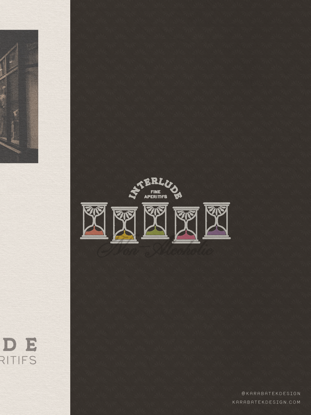
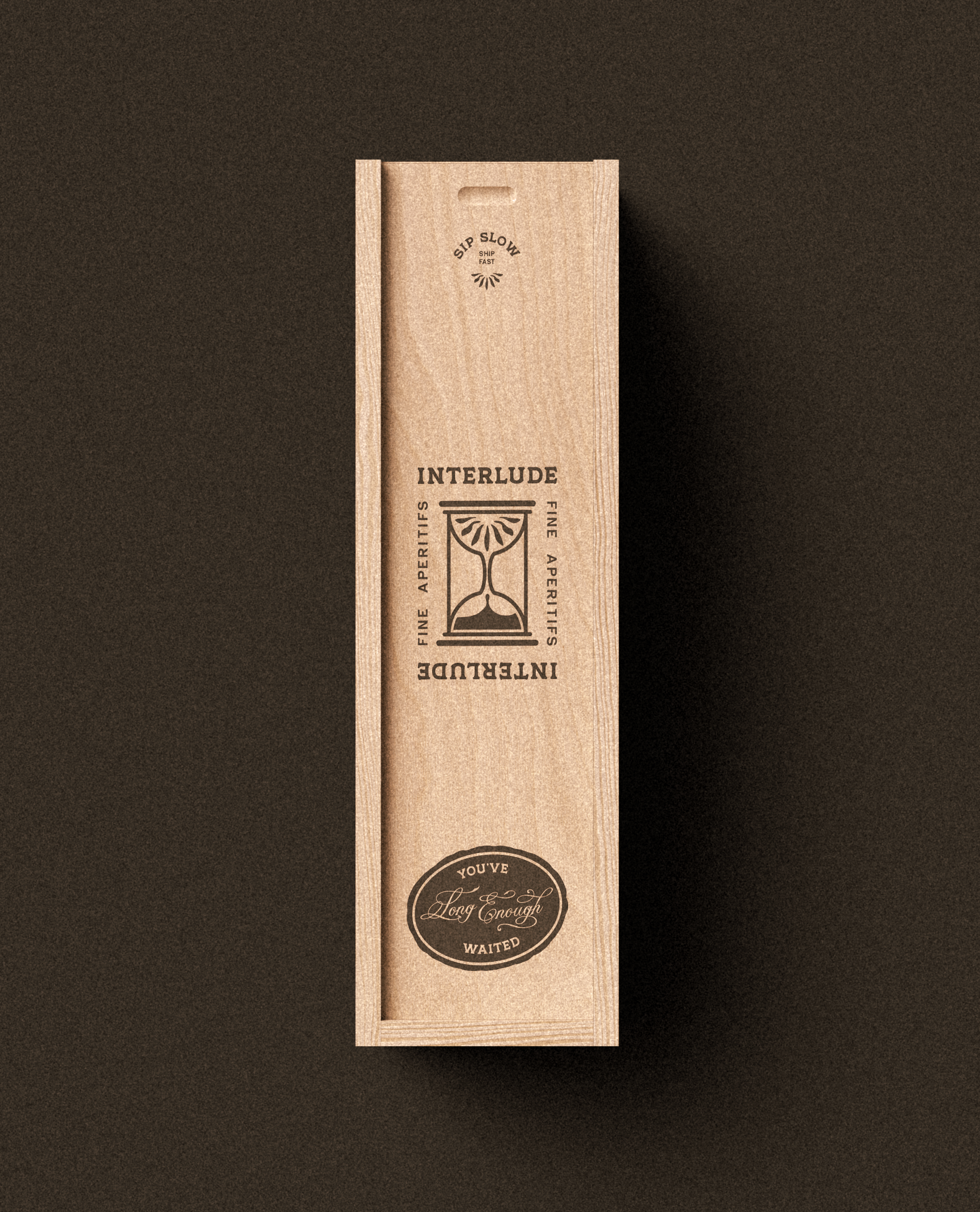
The hourglass motif anchors the abstract name and tells the slow-ferment, natural growth story.
Build warmth in, so restraint never goes cold.
The Inspiration
Ghia and the grown-up non-alcoholic aperitif world.
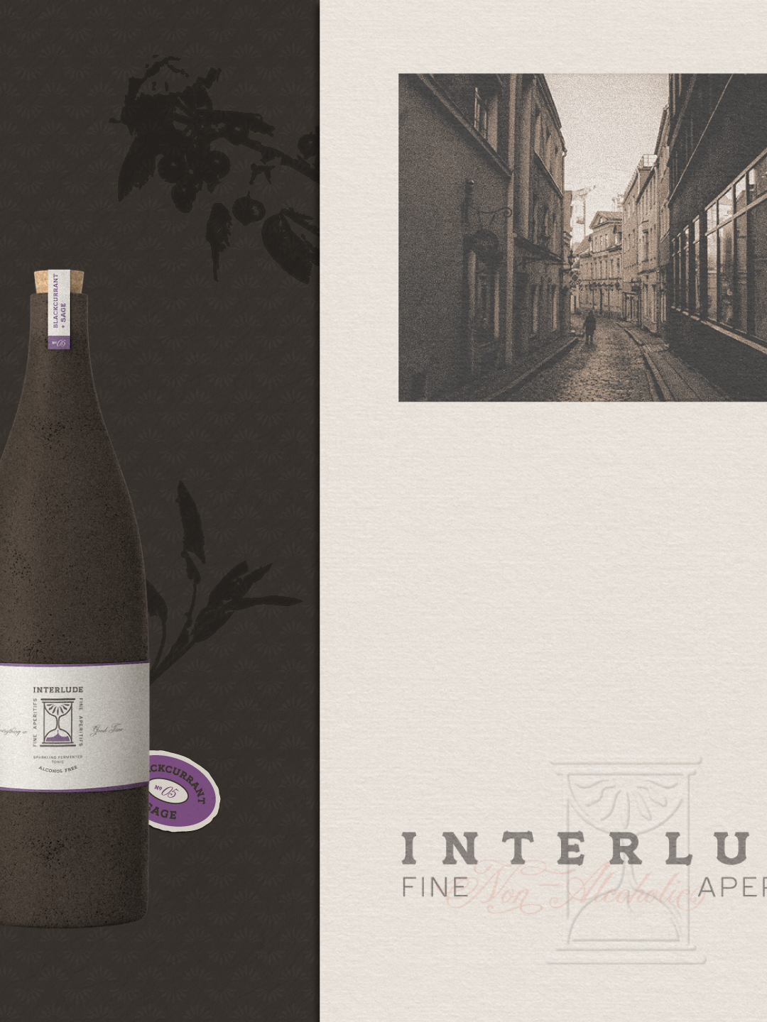
Apothecary, old-world aesthetics.
Natural wine labels expressive inside a quiet framework.
The anti-reference: the bright, interchangeable in-category cans.
The Tactics
Name chosen for the system it could carry—time, slowness, savoring moments—not just its sound.
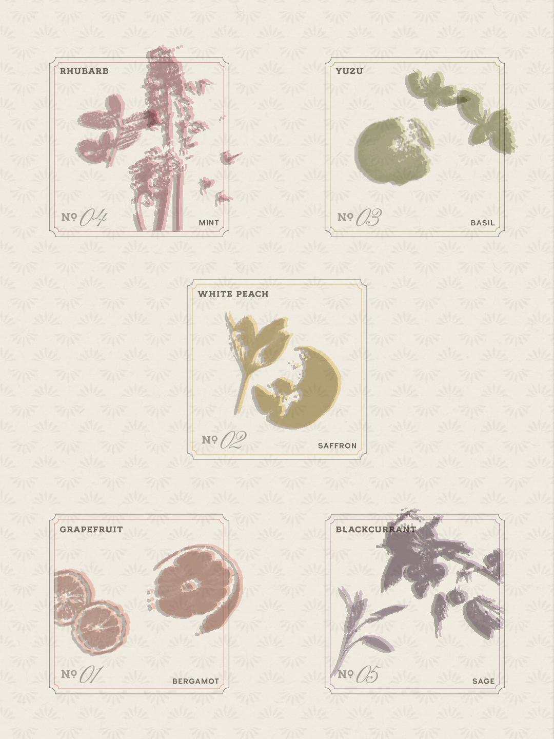
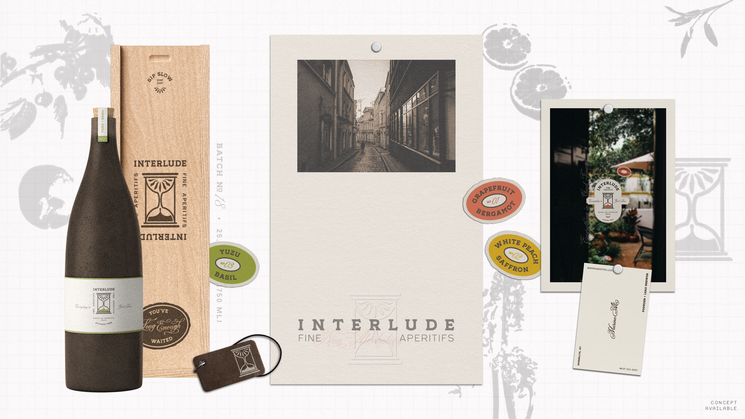
Colors include a warm white base, deep seal brown-gray constant, five warm-biased flavor accents.
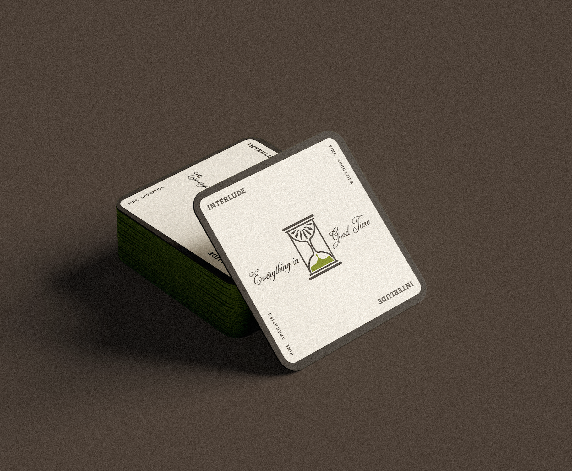
Tagline voice is dryly confident: “Everything in good time.”
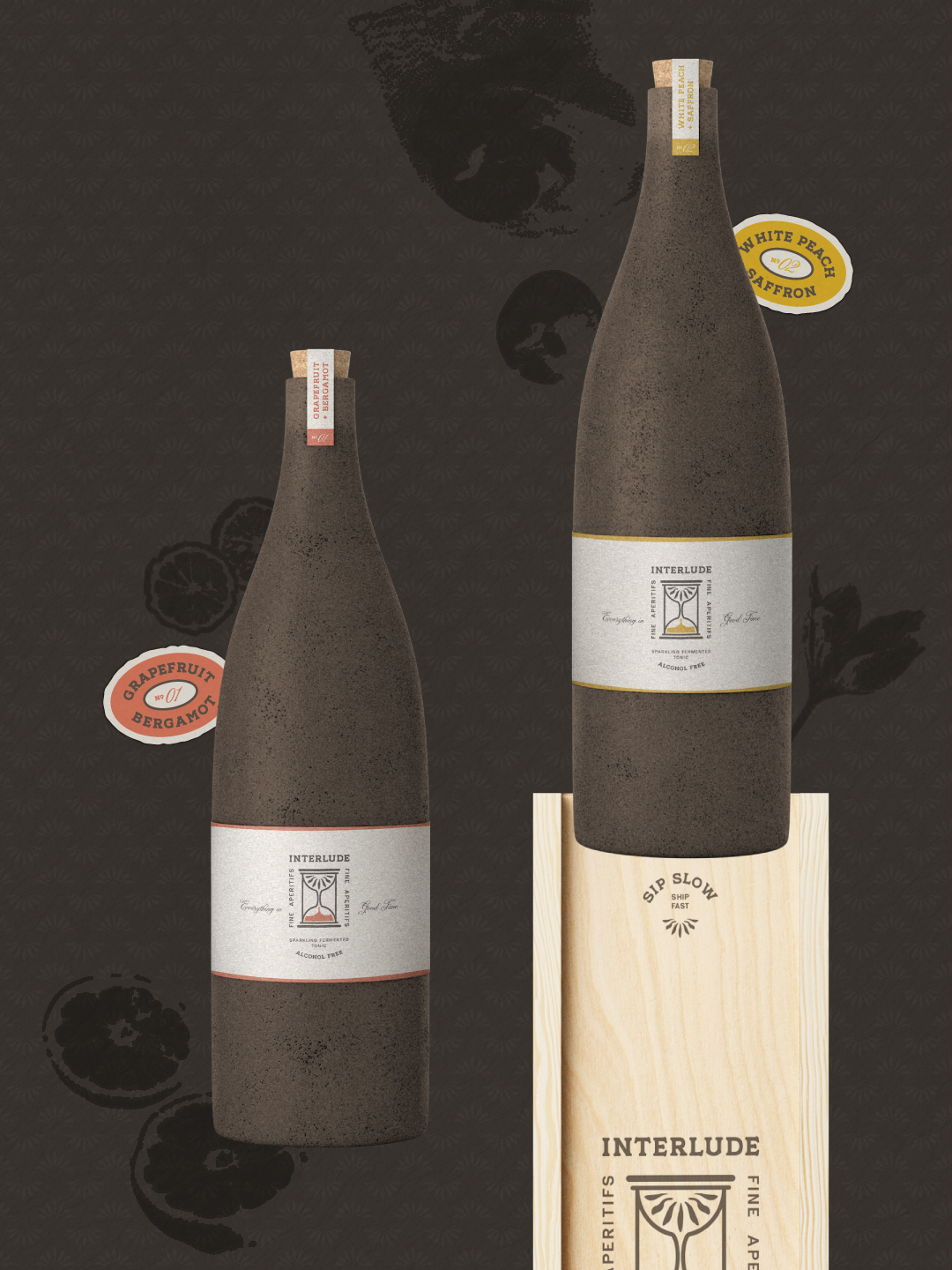
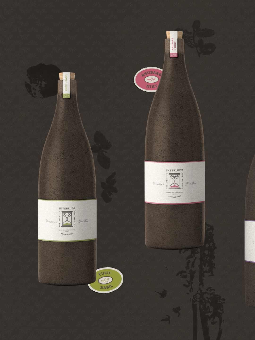
Packaging: front holds only name, hourglass, flavor, one line, with everything else on the back.
The Deliverables
Strategy, naming, and verbal identity
Logo suite with illustrative motif/iconography
Buildable, flavor-and-ingredient–based color system
Typography suite
Brand guidelines
Collateral: coasters, matchbooks, tote bags, subway signage
Packaging